Pennsylvania and the Sheetz/Wawa Battle Line

Sheetz only started expanding into Northeast Ohio back in the 1990s, so I've only recently become aware of the great battle for gas station food supremacy taking place in Pennsylvania.

This may be an unpopular opinion, but they both provide.... gas station food.

The Infamous Strava Heatmap (and why it's fun)

Strava Labs produces a map showing the activities and locations of users of their fitness app.  It was last updated in November of 2017, but it has found its way into the news this week after a Twitter user realized that the data on the map can give away the location of sensitive locations such as military bases and the fitness and patrol routes of people inside the base wearing fitness trackers.

Certainly there is something here that the military needs to consider when it comes to data security, but I feel like the story as reported in the media has been blown out of proportion to some degree.

That said, I'm glad that the media spotlight has fallen on this website, because as map geek there's a lot here to see and explore.

The software filters out car rides and airplane rides by speed, so the result is a map showing where someone has walked, run, cycled, swam, etc. while wearing a fitness tracker.  Parks, trails, and any place with high pedestrian traffic jumps out right away.

Zooming in at the area around our home office, there are three things that jump out at me right away:

1) Summit Mall - you can see the interior walkways of the mall
2) Croghan Park - the footpath which circles around the park is lit up
3) Sand Run Parkway - this road is a popular walking and jogging path, which opens up into a dedicated footpath in the park itself

Strava Heatmap.jpg

There are all sorts of interesting things to find on the map.  Here are a few things I found after a little exploring:

You can see the kayak (and possibly swim?) paths of people crossing Kealakekua Bay on the Big Island of Hawai'i to get to the Captain Cook Monument.

Looking at an overview of the Columbus area, I'm struck by how much the map is just showing where fitness tracker users are.  The northwest quadrant of the city, which is more affluent, is lit up much more than the northeast, and you could pretty much draw the city limits of Bexley based solely on this data.

Here's Mid-Ohio Sports Car Course, a place I'm hoping to walk around myself a few times this year.

Fall Colors From Space

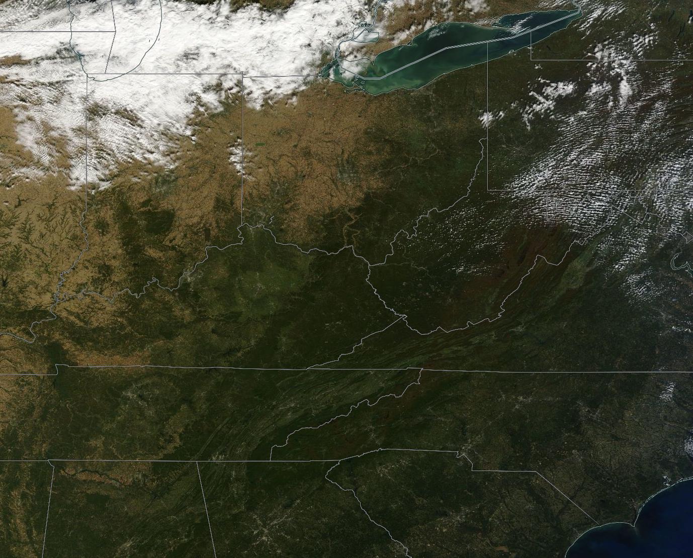
October 11 and 12 were clear days across most of the Great Lakes and Northeast, and the NASA Earth Observatory has highlighted some satellite imagery from those days showing the fall color change:

Fall Color Arrives in the U.S. and Canada

The images come from the MODIS instrument on board the Terra and Aqua satellites.  Terra and Aqua are in sun-synchronous orbits and together they image every location on Earth at least once every two days.

MODIS captures over 36 spectral bands and has many scientific applications, but the reason I like MODIS imagery is that it provides a low-resolution, visible spectrum image of any location and updates very often.  This means you can see what any particular spot on Earth would look like from orbit with your own eyes, every couple of days.

The NASA EOSDIS Worldview page lets you view Terra and Aqua MODIS imagery in very nearly real-time.  It even lets you export geo-referenced imagery, like this one I saved of the Terra imagery from today:

NCAA Fan Map

This is an older map, but college football season is approaching and this map is a favorite of mine.

The New York Times used the volume of Facebook "likes" for each ZIP code to put together a map of college football fandom.

Ohio State fans, similar to Wisconsin and Arkansas, pretty much form a contiguous block in their respective state.  Others are much more divided.

I was in in Fort Wayne, Indiana, recently, and was surprised to see a sports bar with Ohio State, Michigan State, and Indiana University flags flying out front.  I would have expected to see Purdue or even maybe Michigan flags; and looking at the map, appears that Notre Dame fans make up the majority of the Fort Wayne area, followed by Purdue and then Ohio State, so I suspect that particular bar was a bit of a unique outlier.

Still, there are plenty of Michigan fans in Toledo, Ohio University and West Virginia fans in Southeast Ohio, and University of Cincinnati and University of Kentucky fans in the Cincinnati area.

As always, with an interactive map like this, the real fun is zooming in and looking closely at specific areas.

America's Sunniest and Least Sunniest

The Washington Post has an interesting interactive map of the most- and least-sunny counties in the United States:

Map: Where America’s sunniest and least-sunny places are

As for Ohio, much of Northeast Ohio, from Cuyahoga County all the way down to Monroe and Belmont Counties in the south, is among the least-sunny parts of the entire nation.  I would imagine this is a combination of our northern location, along with cloud cover created by the Great Lakes.

In general Ohio gets a little more sunshine gradually as you go southwest towards Cincinnati - except for one area of interest: Erie, Huron, and Lorain Counties, which are the sunniest counties in Ohio, and in fact just slightly above the national average.

Summit County Relief Model

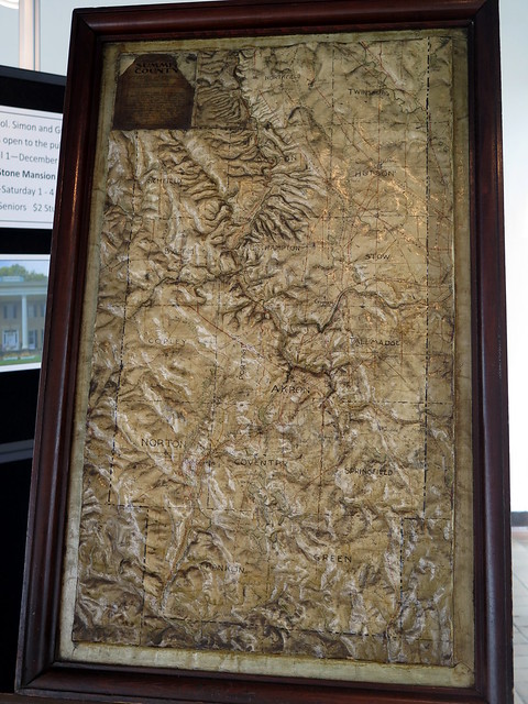
I was doing some plat research at the Summit County Courthouse this week, when I noticed this really interesting Summit County Relief Map on display

You really need to view the full image to fully appreciate it.  It's a map of Summit County, but with actual relief instead of contours.  The Cuyahoga River valley is obviously very prominent.

I'm not sure when it was made - I didn't see a date anywhere on the model, and I didn't see an explanatory sign anywhere.  I would guess it's from sometime between 1880 and 1910.  It was hard to get a really good photo because it's behind glass; it appears to be a temporary display by the Summit County Historical Society.  I think I should make a trip over there sometime to see if I can get a better look at it!

Summit County Relief Model

Alongways

I came across a webpage/cell phone app the last week that I've found incredibly useful:

Alongways.

I'm sure most of us are familiar with using services like Google Maps to find the closest locations of particular types of things, whether you're looking for a particular restaurant, grocery store, gas station, etc.

And Google Maps is good at that - as long as you are looking for the closest example to where you are located at that moment.

But more often, I would much rather know what the most convenient locations are along a route that I need to travel.  If I am driving from Akron to Fremont to Columbus to Akron, it may be more helpful to know where a post office is along that route, rather than which one is closest to my current location.

That's where Alongways comes in - you enter your beginning and ending points, and then search for a particular thing along that route.  It will suggest the most convenient examples along that route (it will cast a slightly wider net over a longer route).

I've been really happy with the results so far.  The webpage is free, and there is an app available for Android or iOS for $1:

http://alongways.com/
 

Old Maps Online

I recently came across a great website for browsing or viewing old maps, the aptly named Old Maps Online.

Old Maps Online is a collaboration between The Great Britain Historical GIS Project based at The University of Portsmouth, UK and Klokan Technologies GmbH, Switzerland, and despite its European origins, has an incredible wealth of old maps worldwide.

When you first navigate to the site it will automatically take you to your detected location.  Many of the maps are available in very high resolution.

At the moment I'm particularly enjoying this map of the Connecticut Western Reserve from 1833.